Discover the colors that look best on you
Find your seasonal color palette and learn which colors complement you - from what to wear to what to shop.
Free seasonal color analysis. Coming soon.
Join the early access list and be among the first to discover your palette.
01
Join early access
Enter your email to be among the first to try Look Palette's free seasonal color analysis.
02
Discover your best colors
When Look Palette launches, upload a photo to discover your seasonal palette and the colors that complement you.
03
Shop your palette
Explore clothing recommendations selected to match your seasonal colors and make shopping easier.
Palette Library
Explore the full twelve-season system
Each palette blends warmth, depth, and clarity differently. Start with the visual overview below, then dive into the detailed palette pages for skin, hair, eye, metal, gemstone, and swatch guidance.
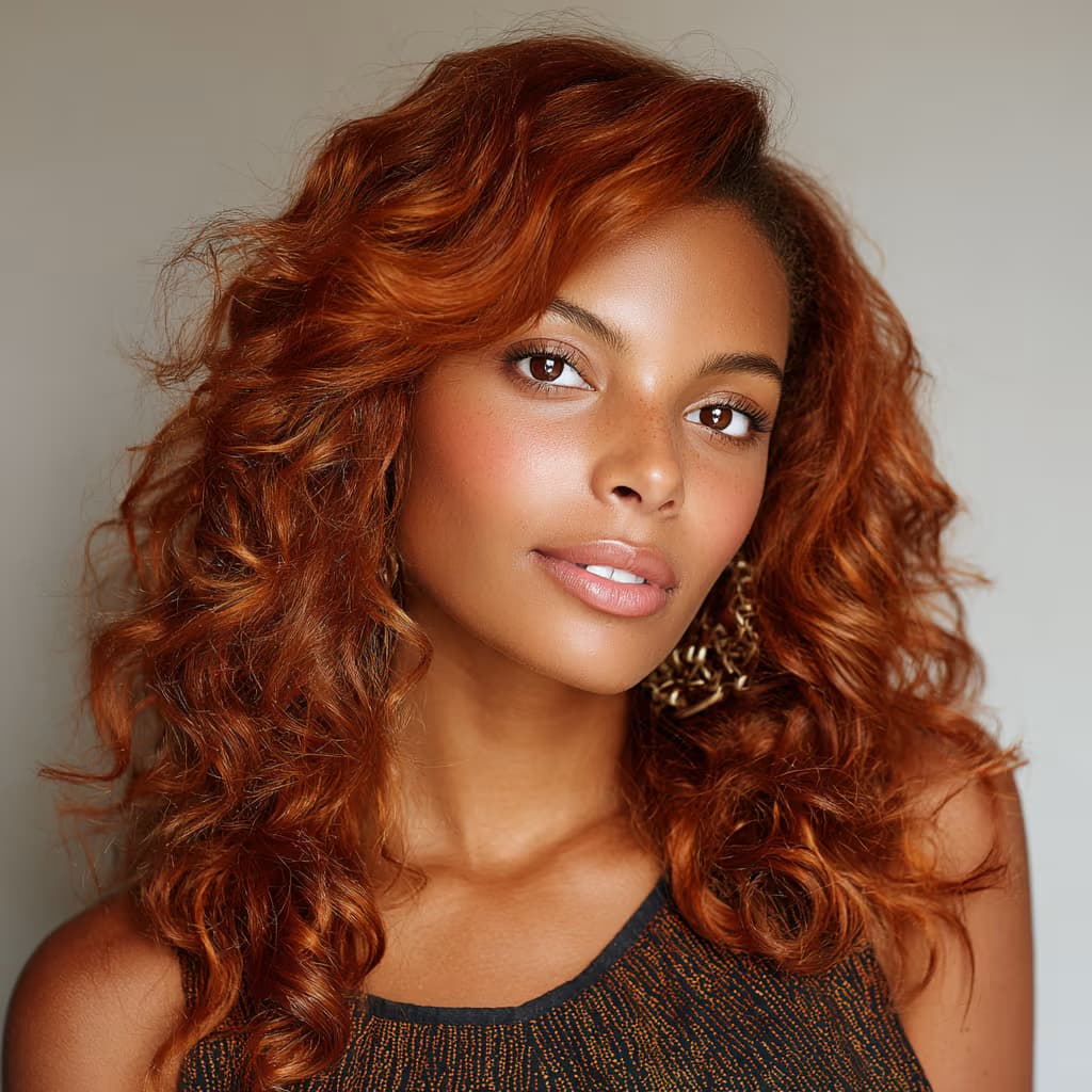
Spring
Clear Spring
Clear Spring is vivid, bright, and sparkling. This palette thrives on clarity and contrast—brilliant corals, turquoise, emerald, and pure yellows bring it to life.
View Palette ->
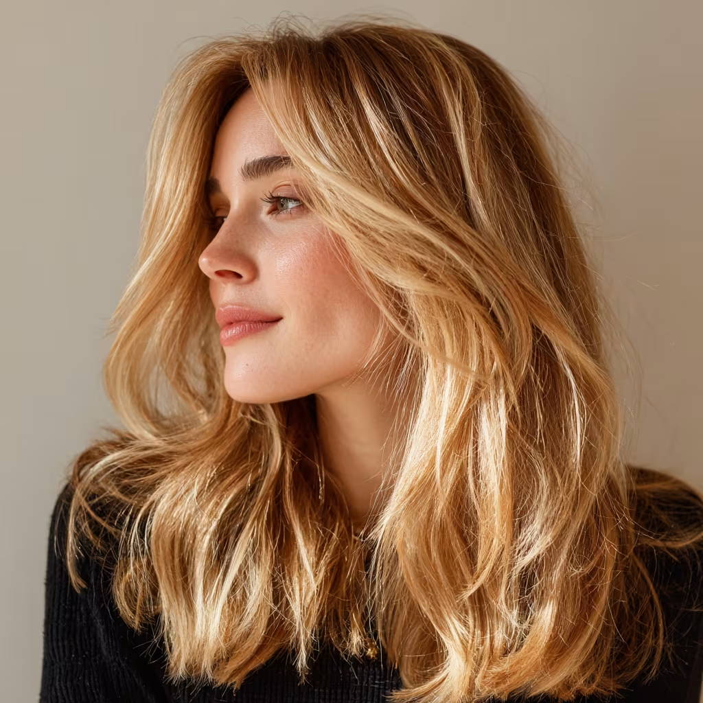
Spring
Warm Spring
Warm Spring is golden, radiant, and full of life. This palette glows with sunshine shades—think golden yellows, peachy corals, turquoise, and warm greens.
View Palette ->
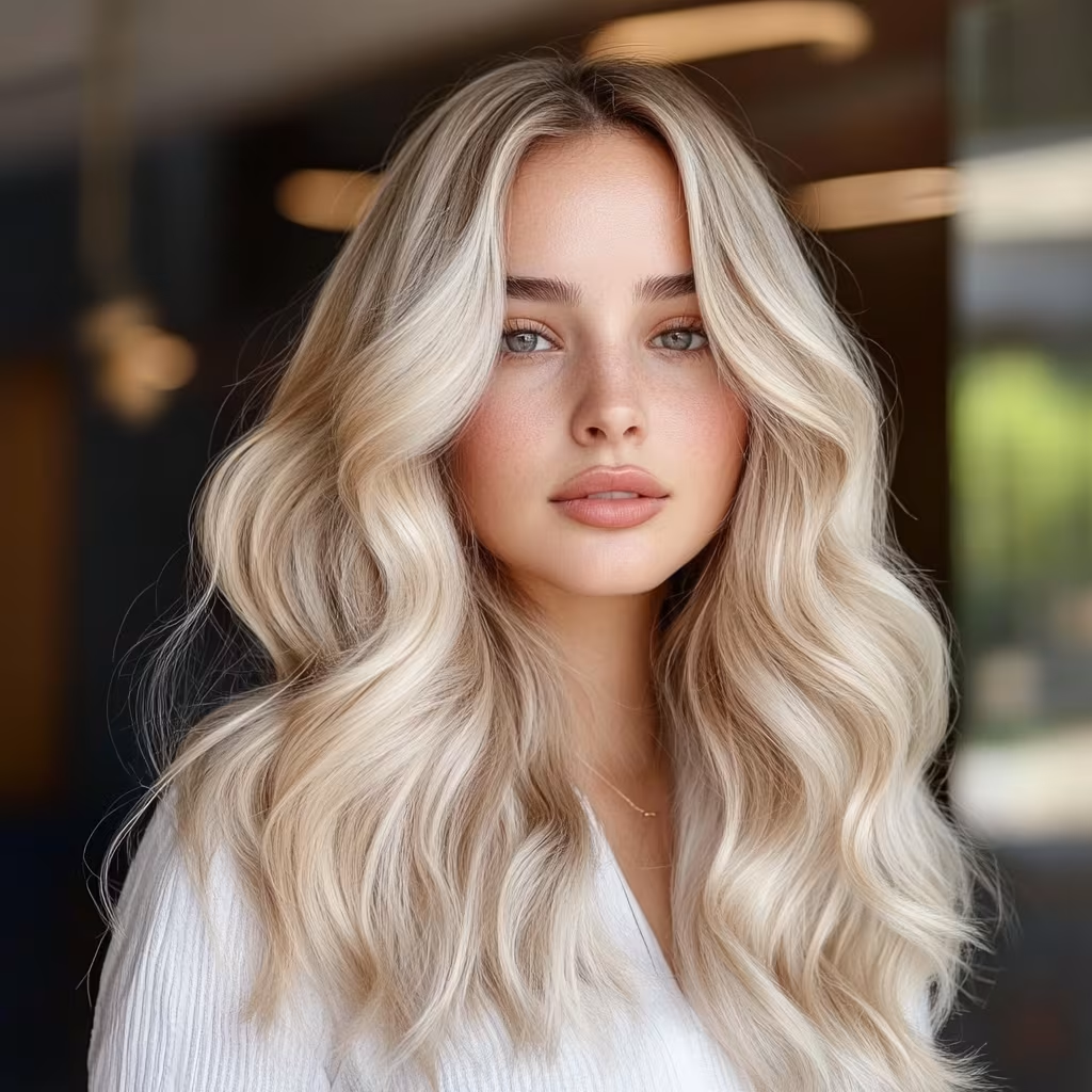
Spring
Light Spring
Light Spring is delicate, fresh, and luminous. This palette shines with airy pastels and soft, golden undertones that bring out a gentle radiance.
View Palette ->
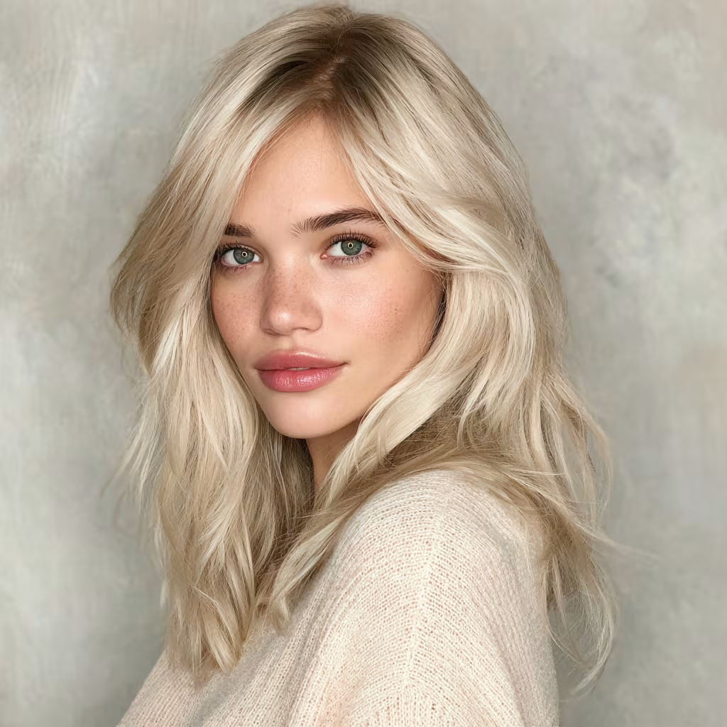
Summer
Light Summer
Light Summer is soft, cool, and delicate. This palette glows in light pastels with cool undertones—lavender, powder blue, mint, and soft rose.
View Palette ->
Summer
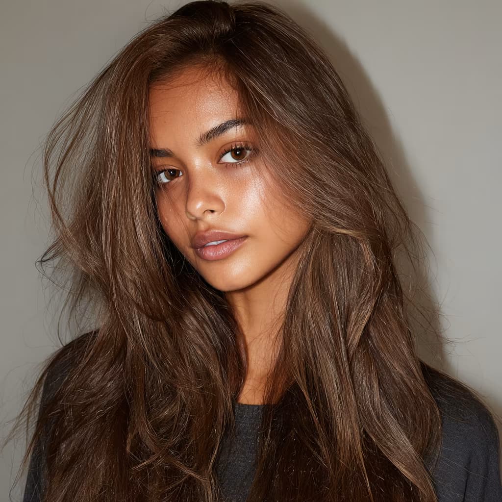
Cool Summer
Cool Summer is elegant, refined, and calm. This palette thrives on cool undertones with muted clarity—rose pink, cool navy, lavender, and soft greys shine brightest.
View Palette ->
Summer
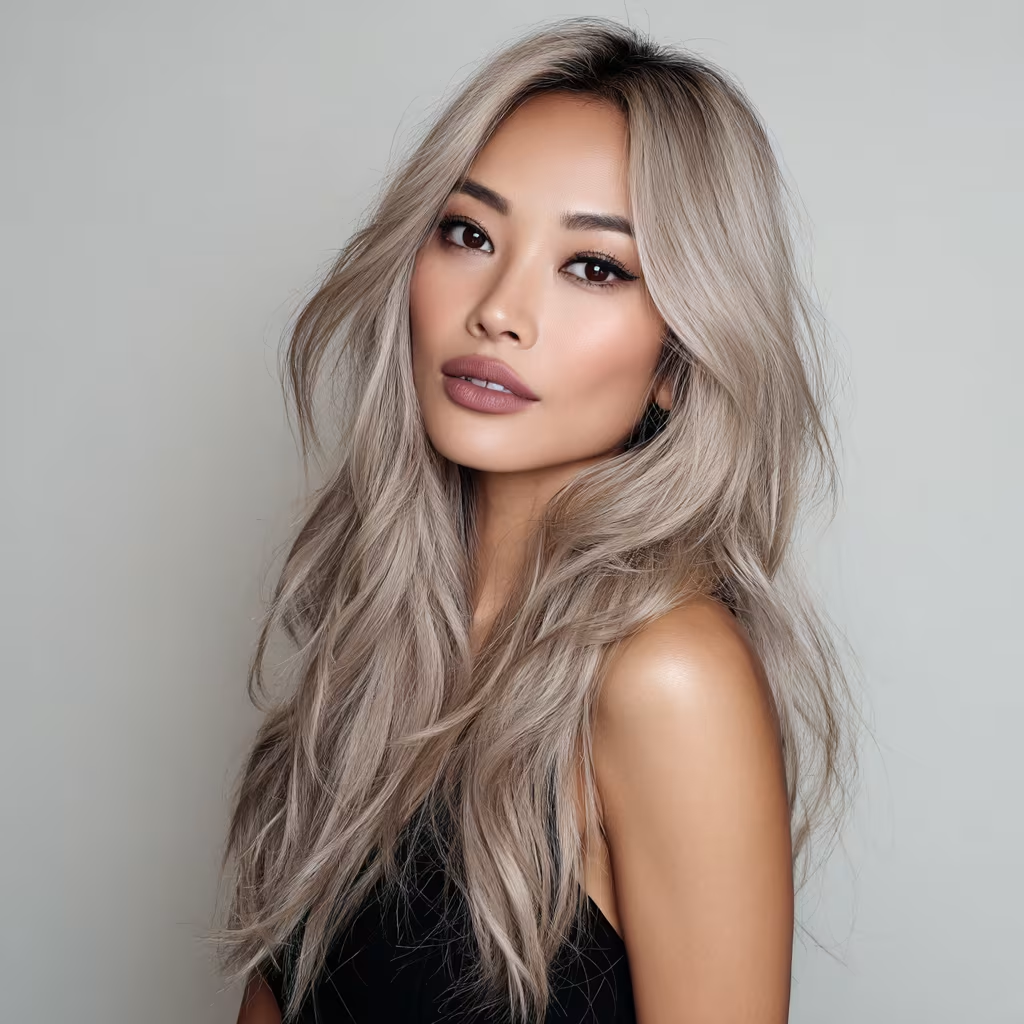
Soft Summer
Soft Summer is muted, blended, and harmonious. This palette thrives on understated tones—mauve, dusty rose, cool taupe, sage green, and smoky blue.
View Palette ->

Autumn
Soft Autumn
Soft Autumn is muted, gentle, and understated. This palette shines in earthy neutrals—muted peach, moss green, dusty rose, taupe, and warm grey.
View Palette ->
Autumn
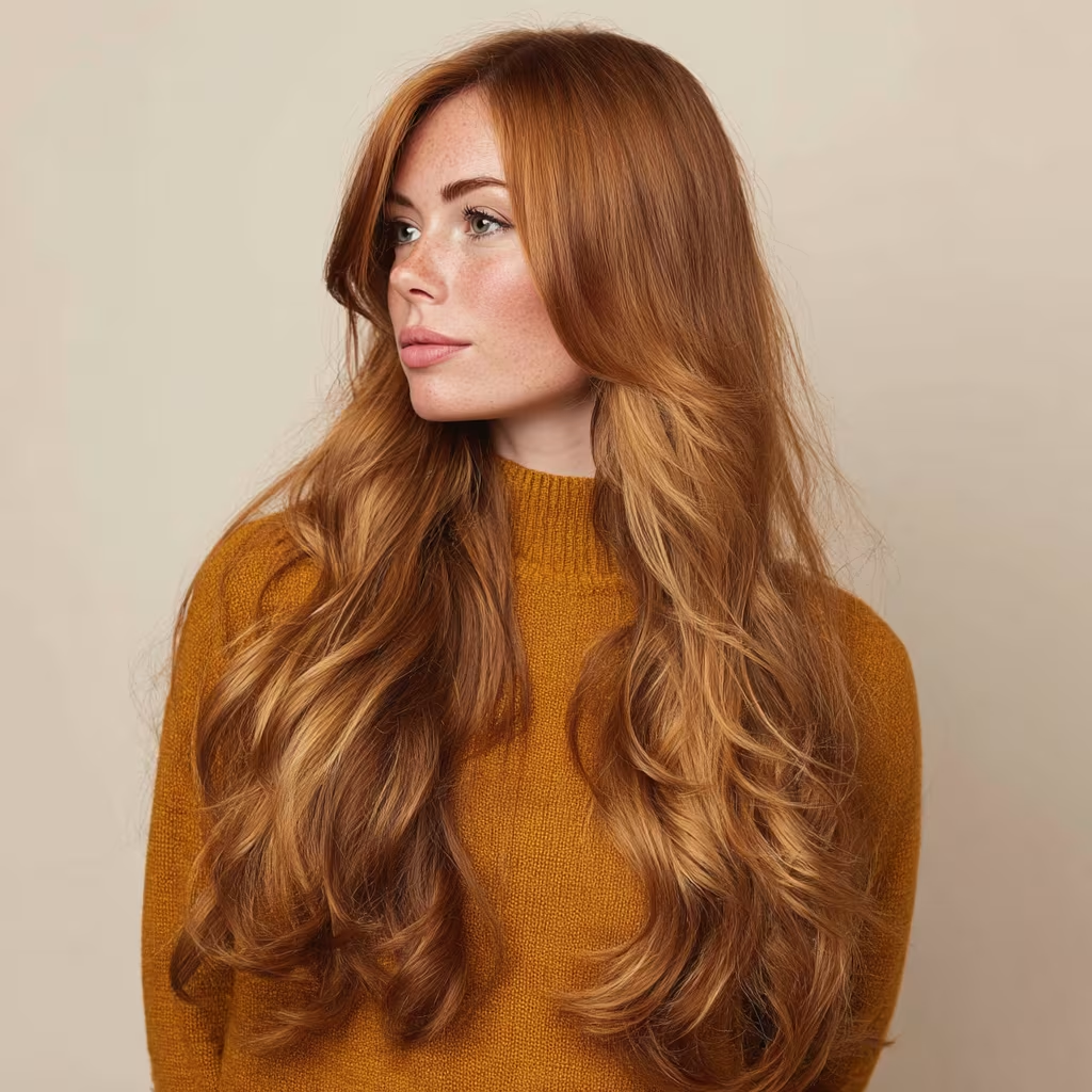
Warm Autumn
Warm Autumn is rich, earthy, and golden. This palette thrives in glowing tones—burnt orange, golden yellow, moss green, and warm browns bring it to life.
View Palette ->
Autumn
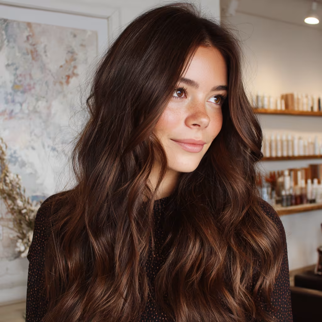
Deep Autumn
Deep Autumn is dramatic, intense, and rich. This palette thrives on depth—dark teal, deep olive, burgundy, rich browns, and golden mustard bring it to life.
View Palette ->
Winter
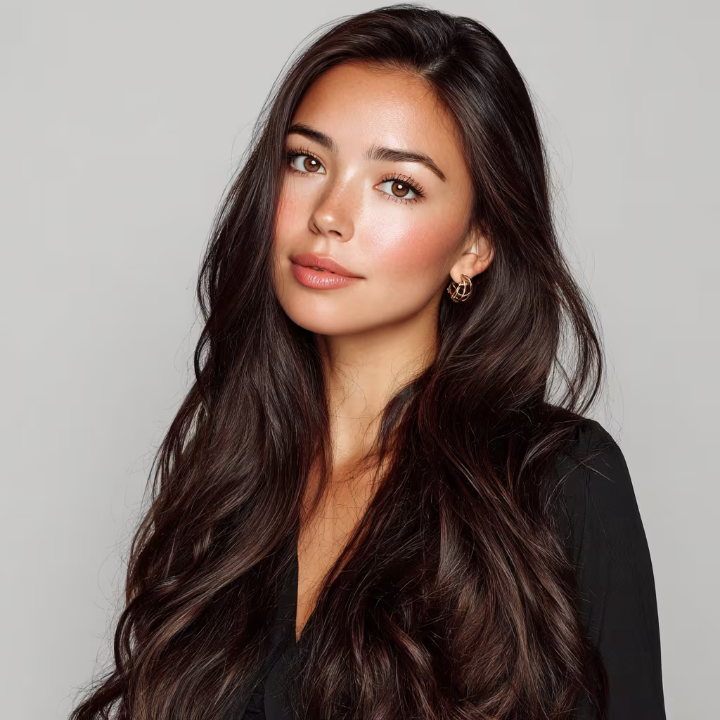
Deep Winter
Deep Winter is rich, dramatic, and intense. This palette thrives in deep, cool shades—charcoal, navy, emerald, burgundy, and magenta.
View Palette ->

Winter
Cool Winter
Cool Winter is crisp, icy, and refined. This palette thrives on cool, high-contrast colors—true black, pure white, navy, emerald, and fuchsia.
View Palette ->
Winter
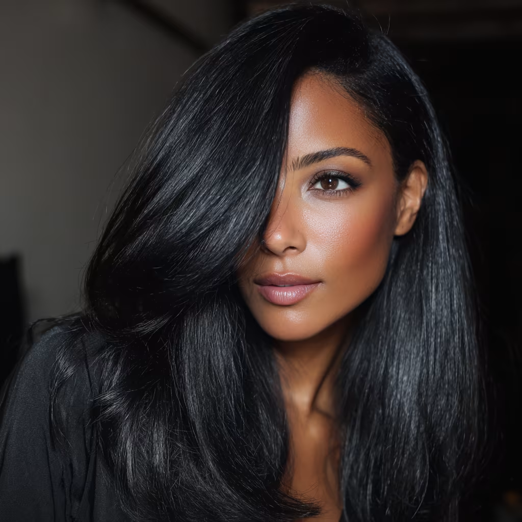
Clear Winter
Clear Winter is bright, vivid, and high-contrast. This palette shines in jewel tones—ruby red, emerald green, cobalt blue, and fuchsia.
View Palette ->
Free Tool
Use the image color picker today
While the personalized analysis experience is still in early access, the image color picker is already live and useful for pulling swatches from outfits, screenshots, moodboards, and inspiration images.
Image Color Picker
Upload a photo, click the colors you love, and export swatches in multiple formats.
Open tool ->